Project information
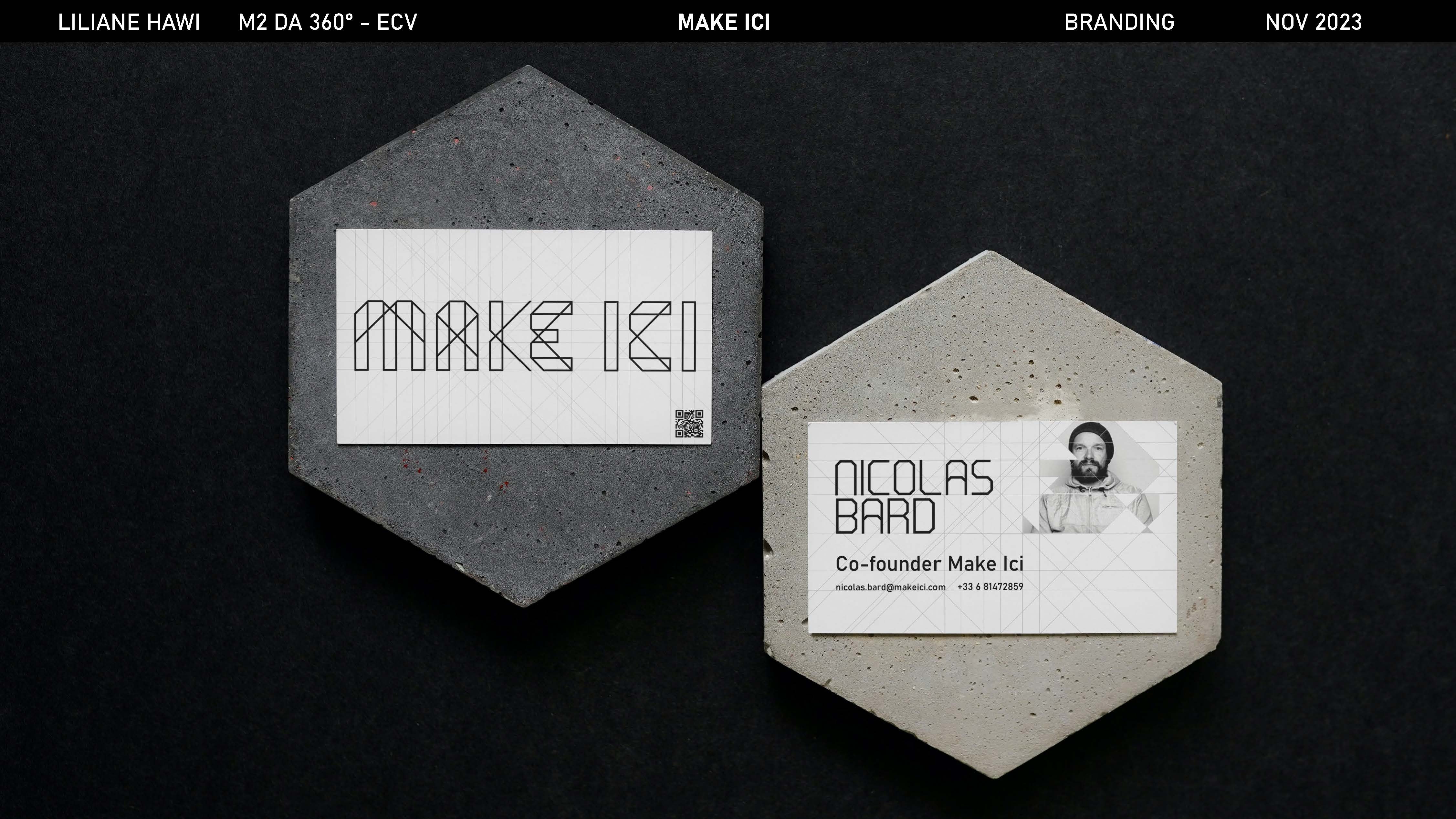
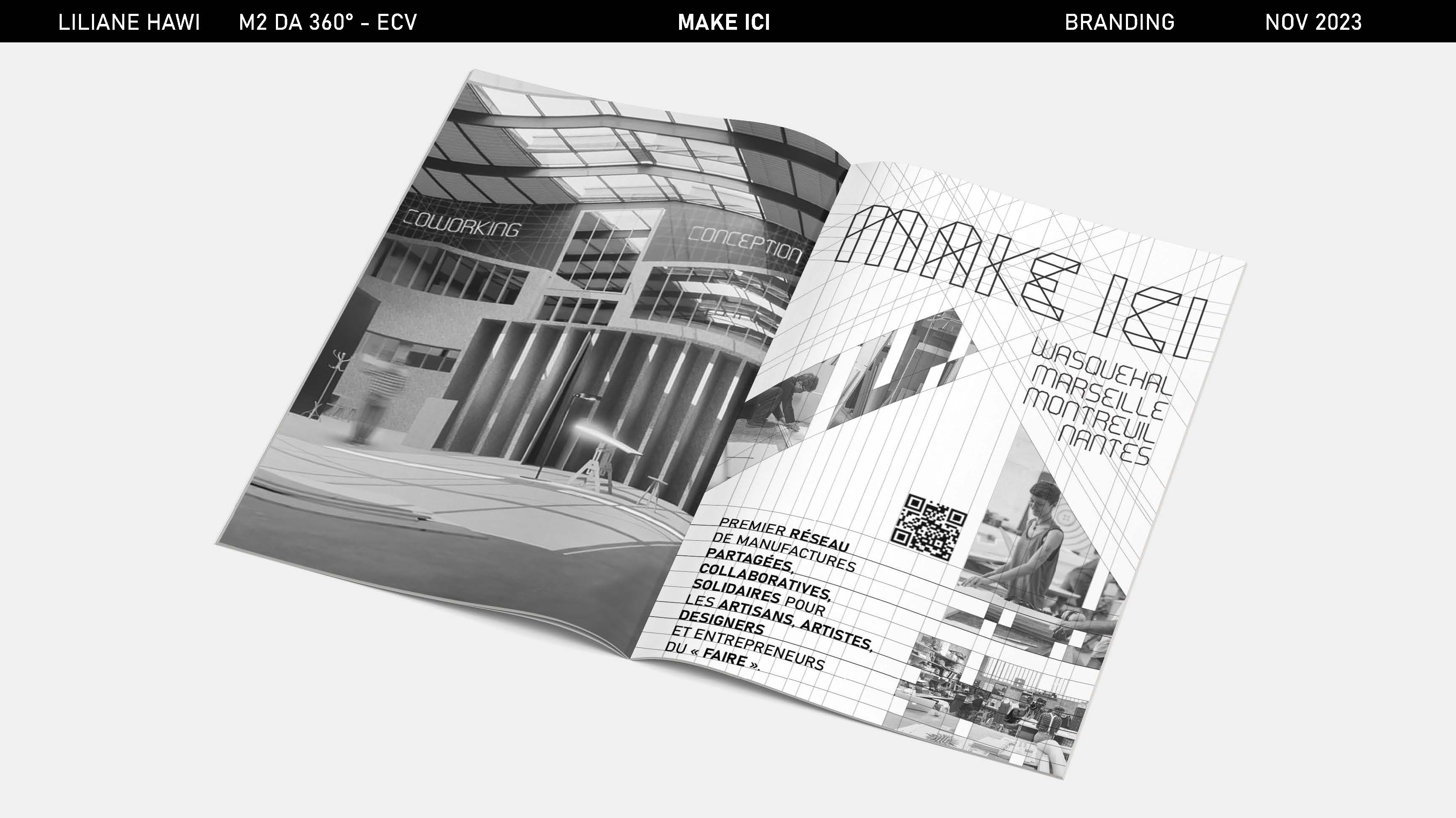
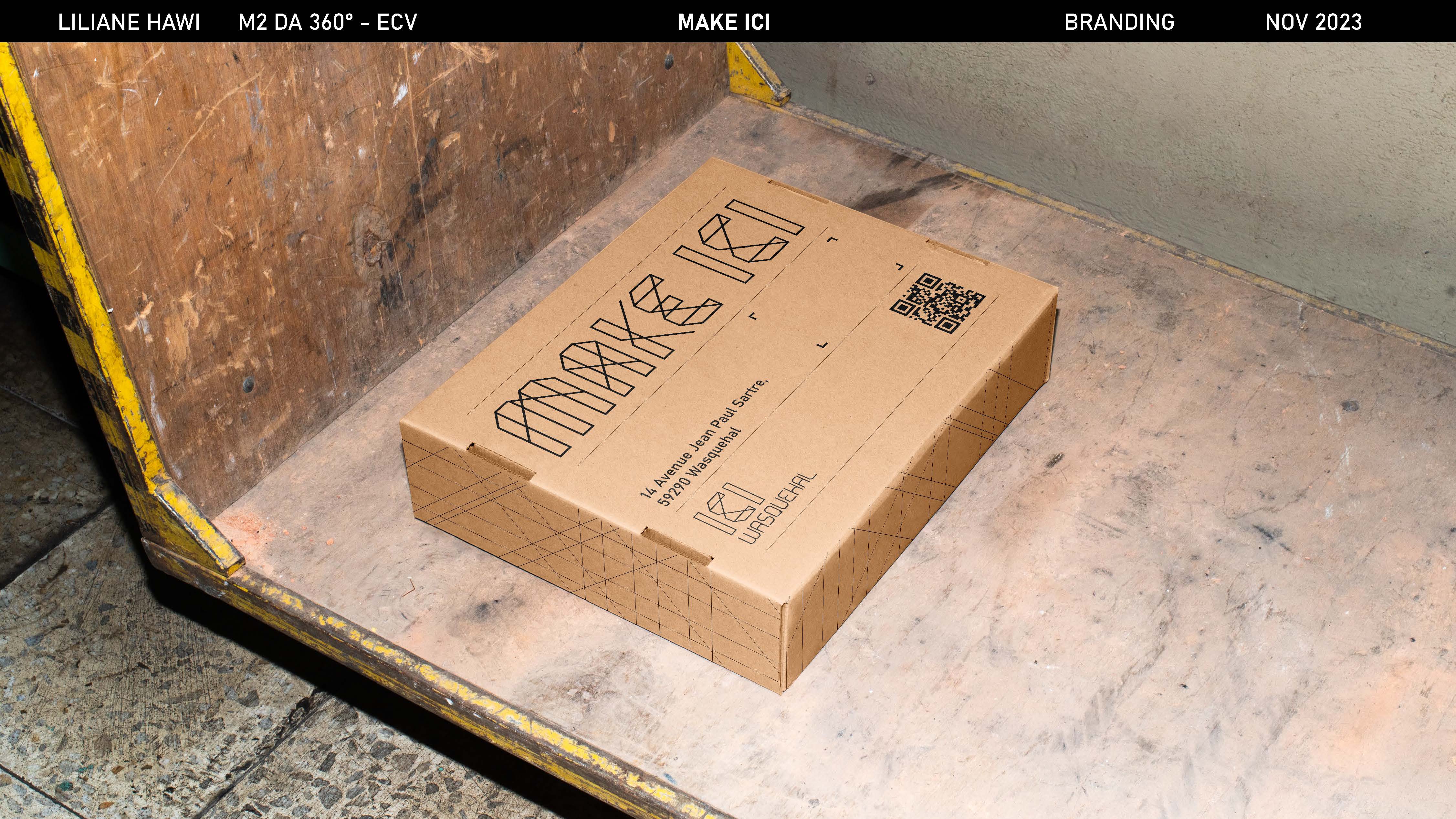
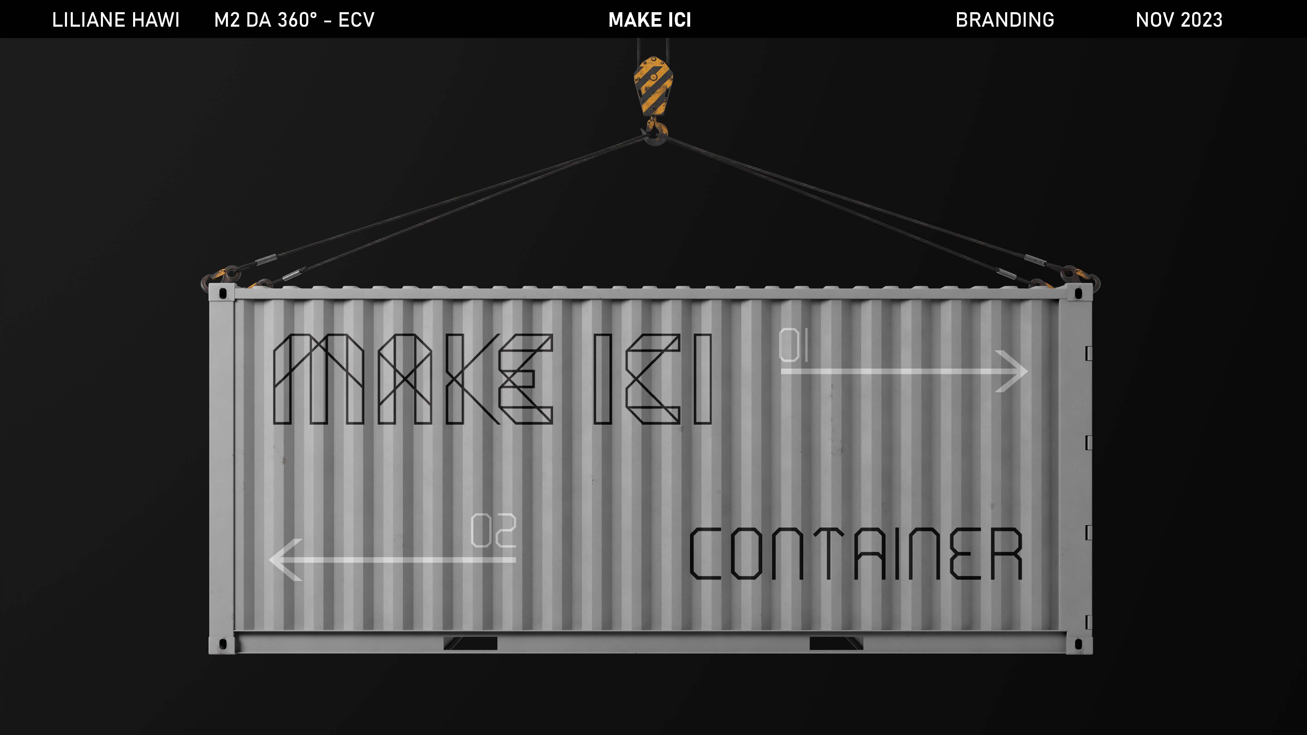
- Brief: Create a new brand identity for Make Ici workshops co-working spaces.
- Category: Branding / Typography
- Project date: 2023
MAKE ICI
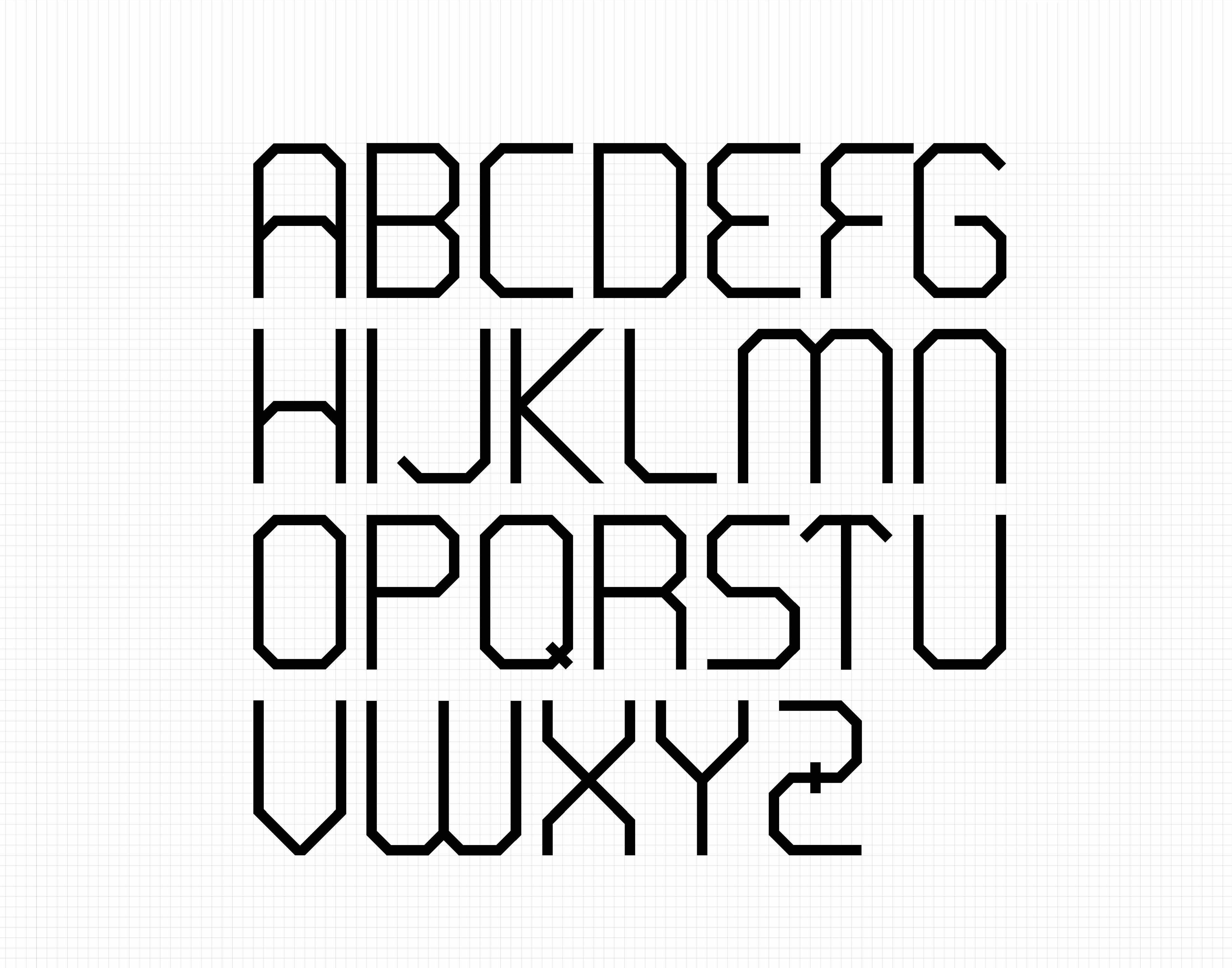
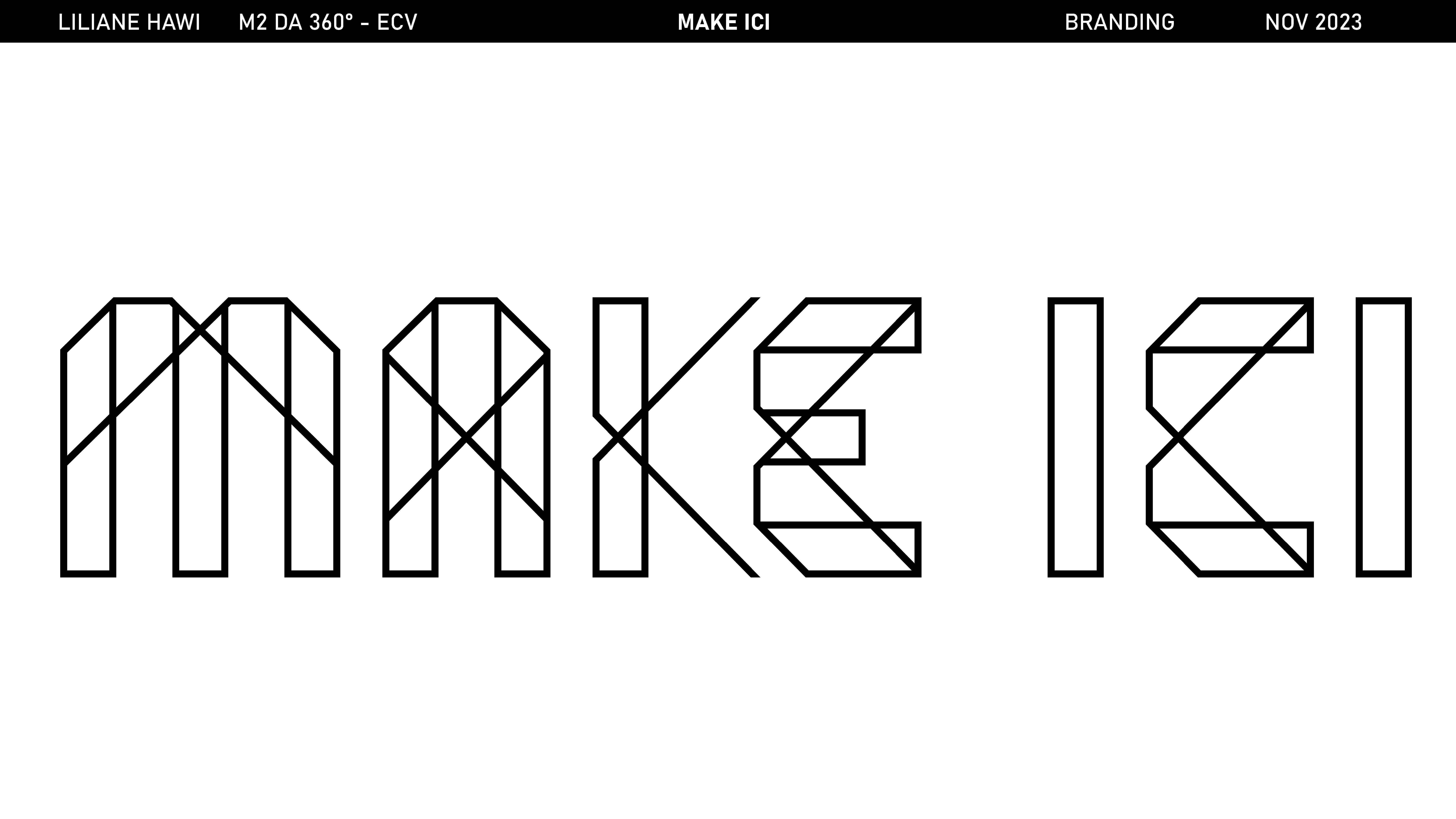
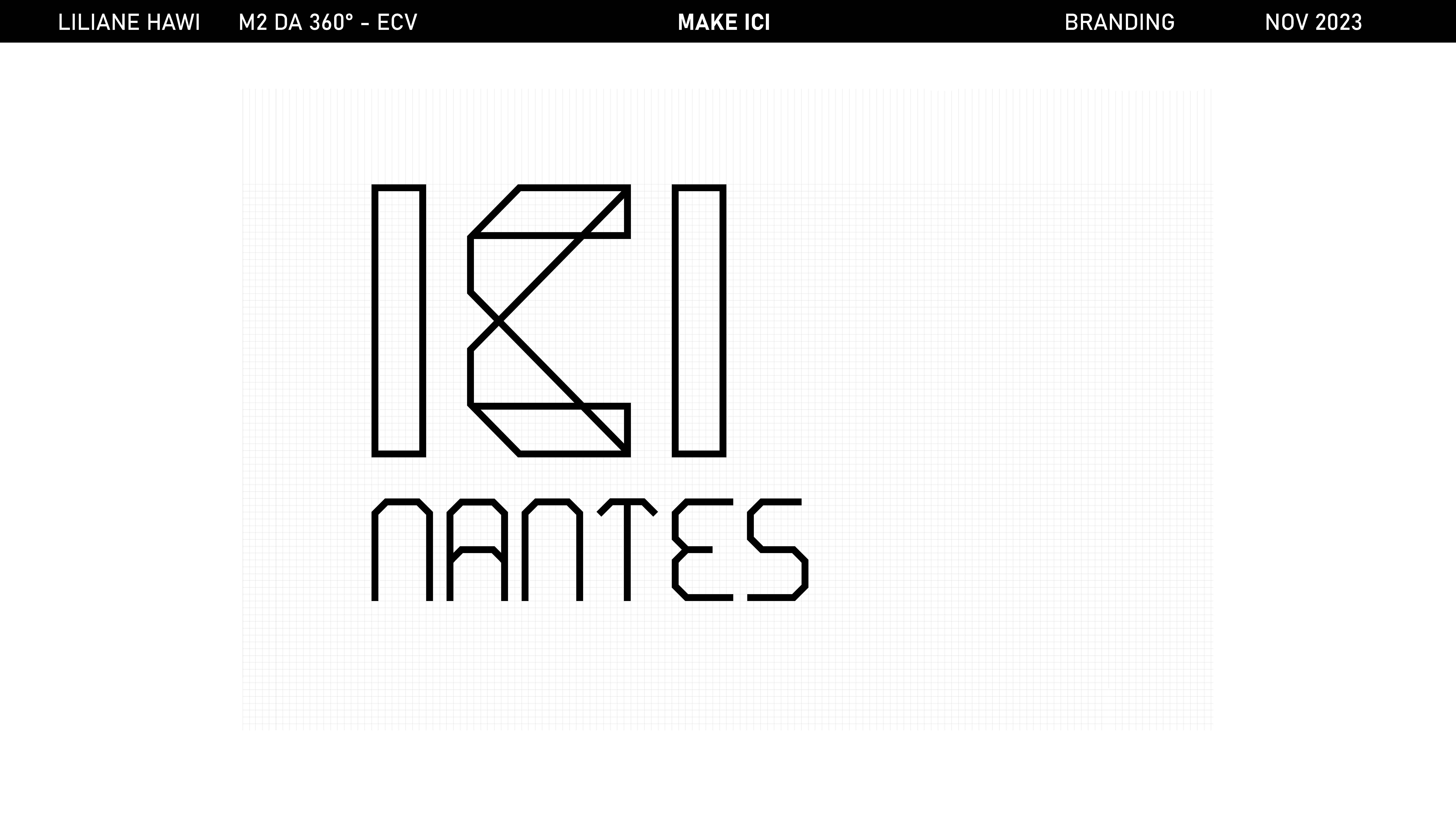
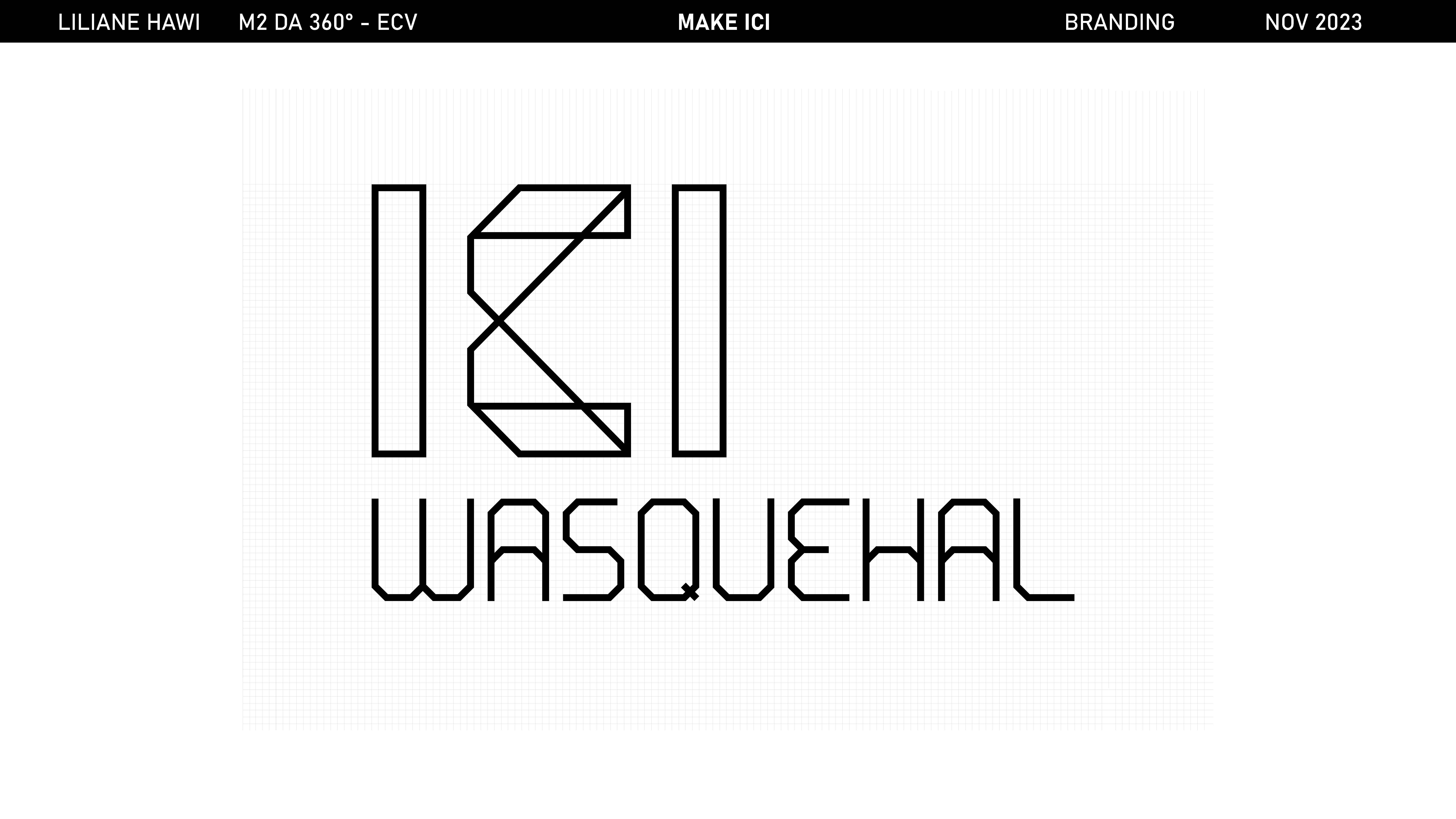
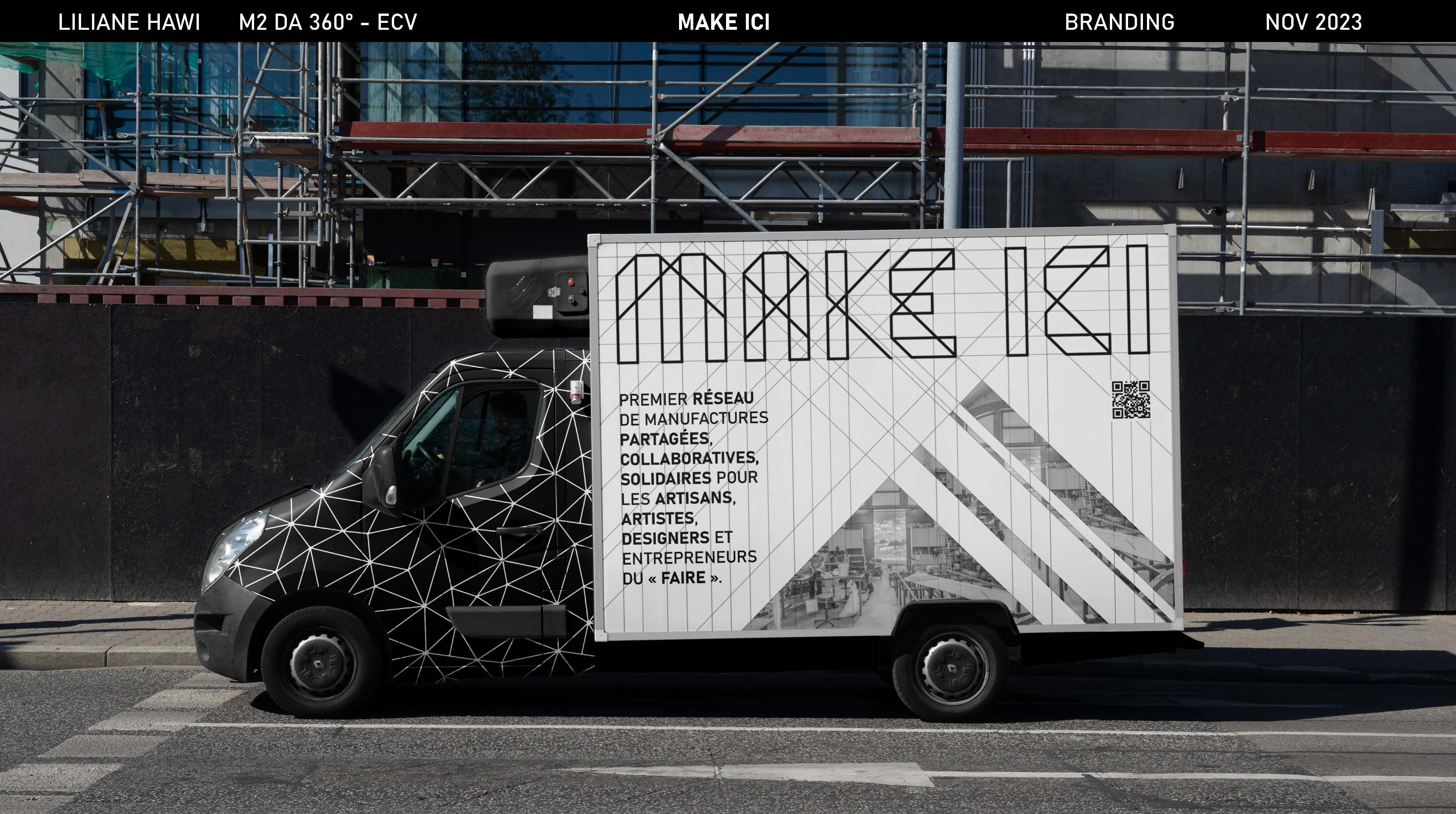
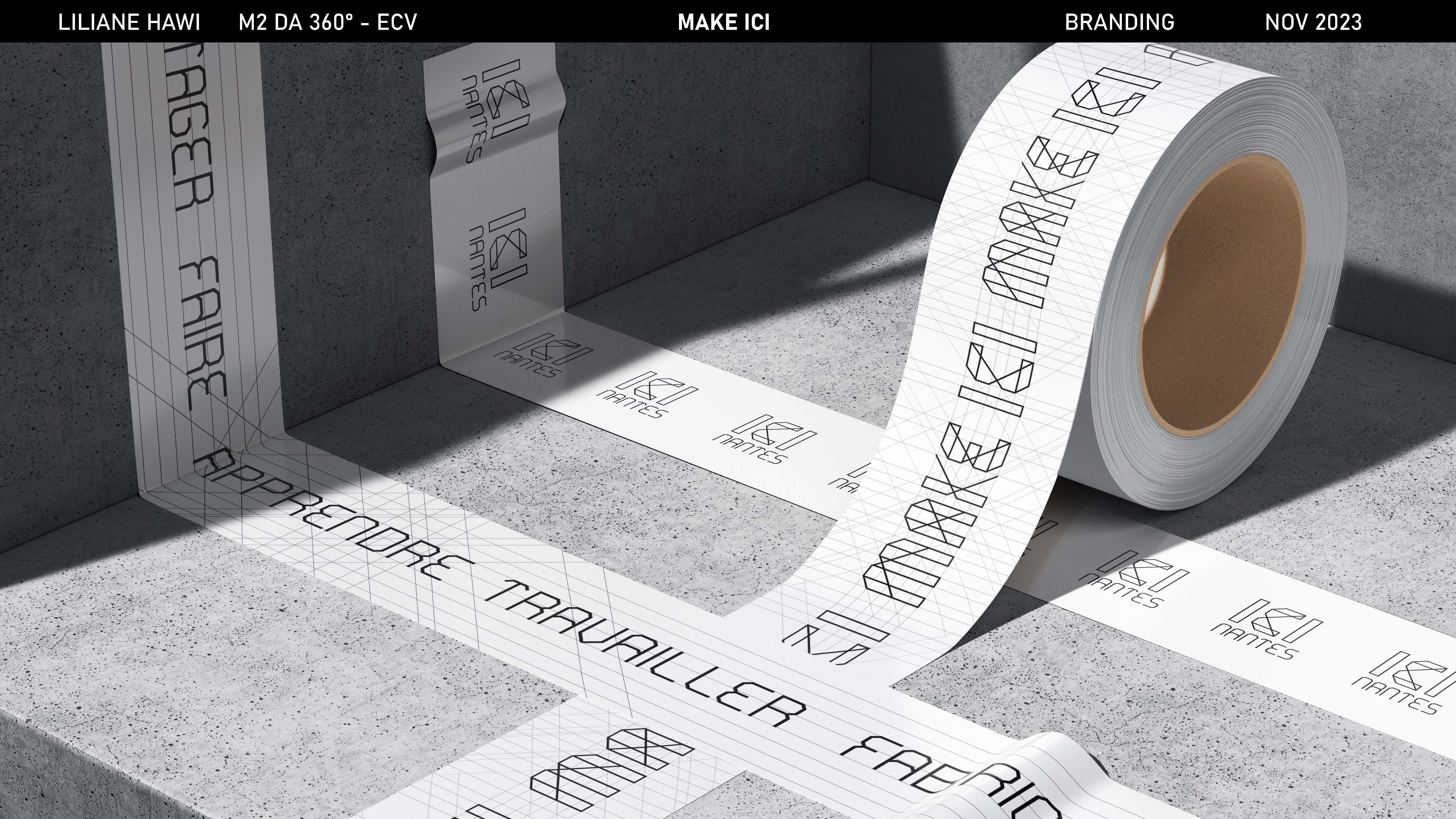
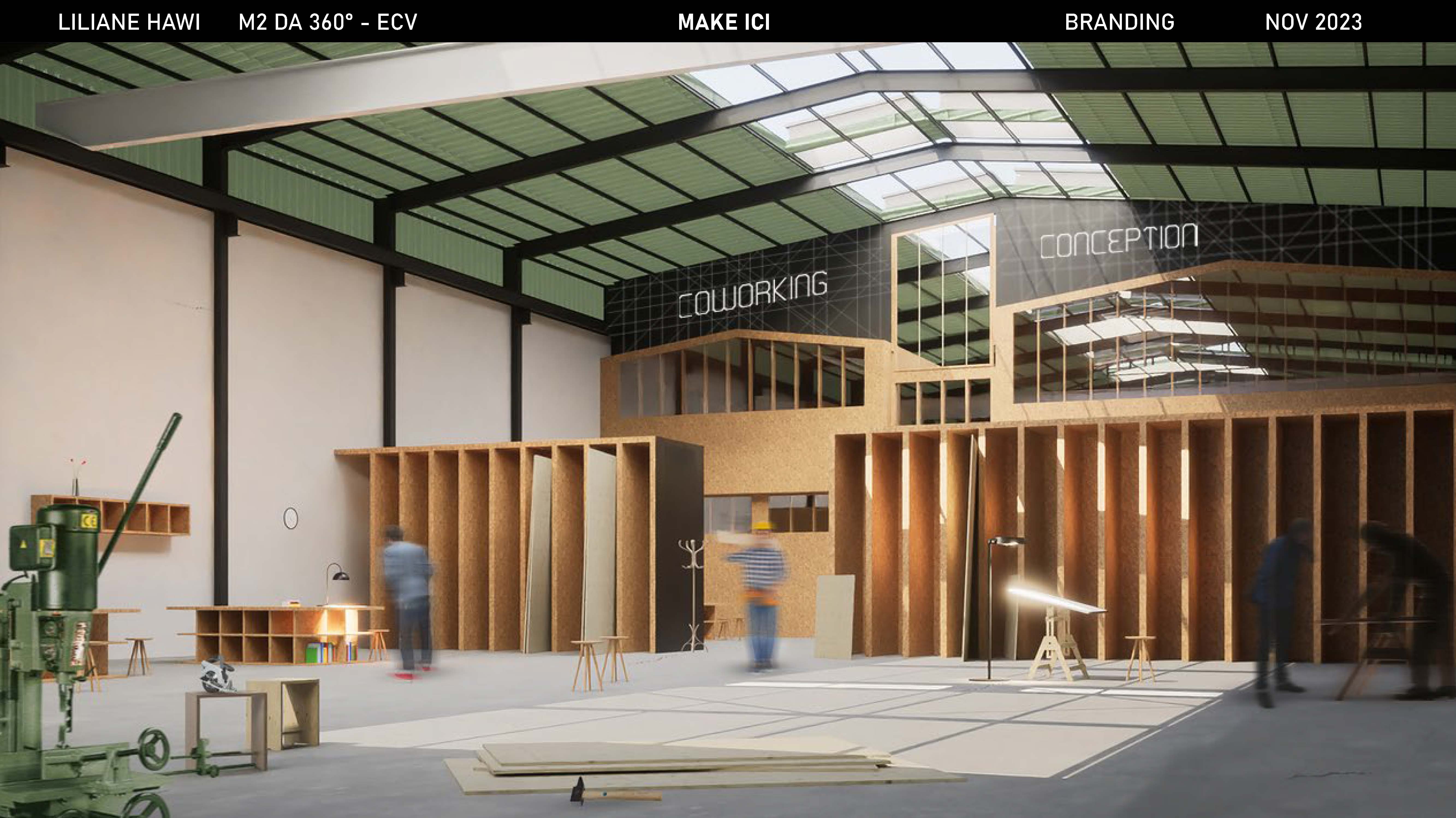
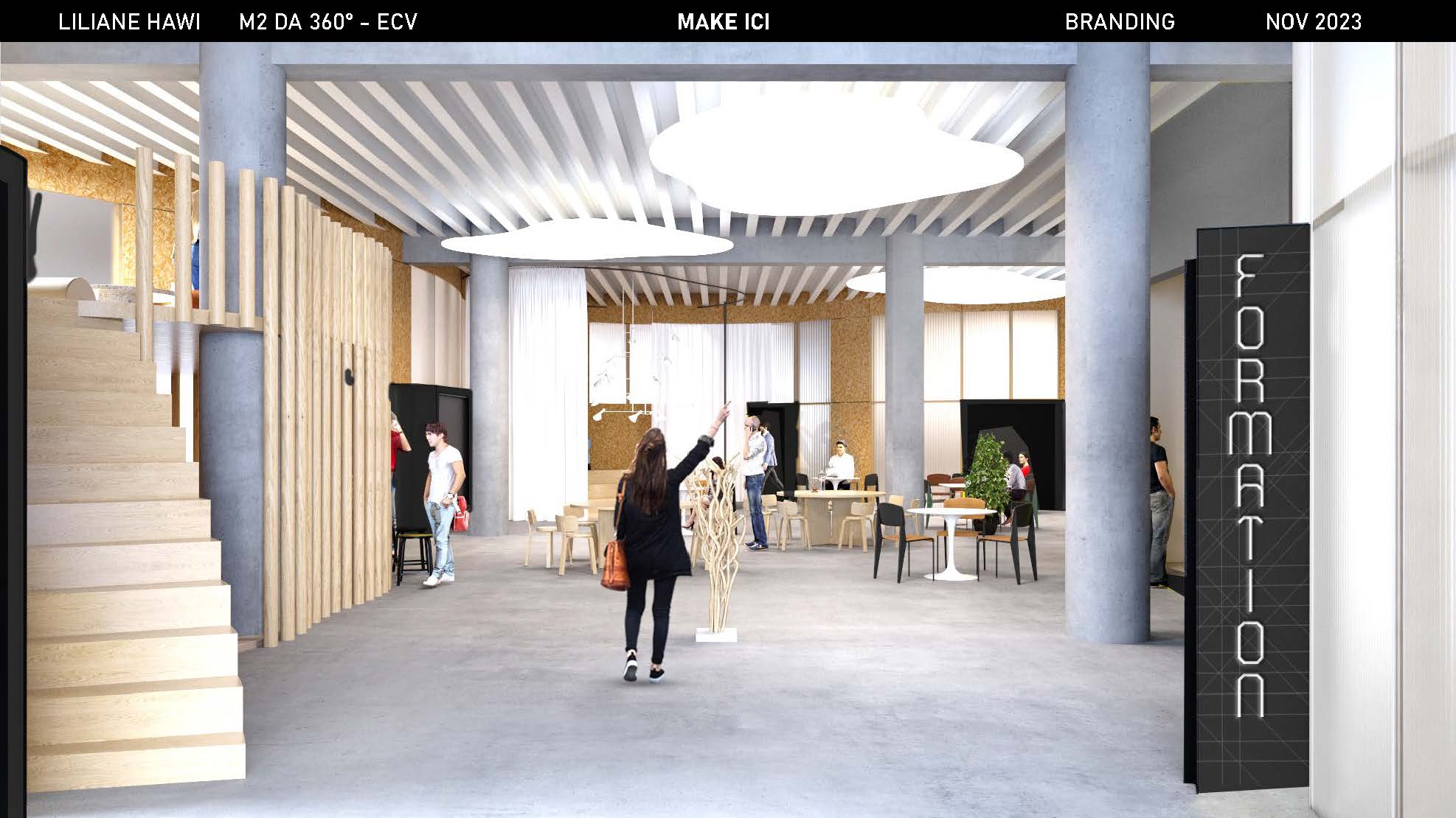
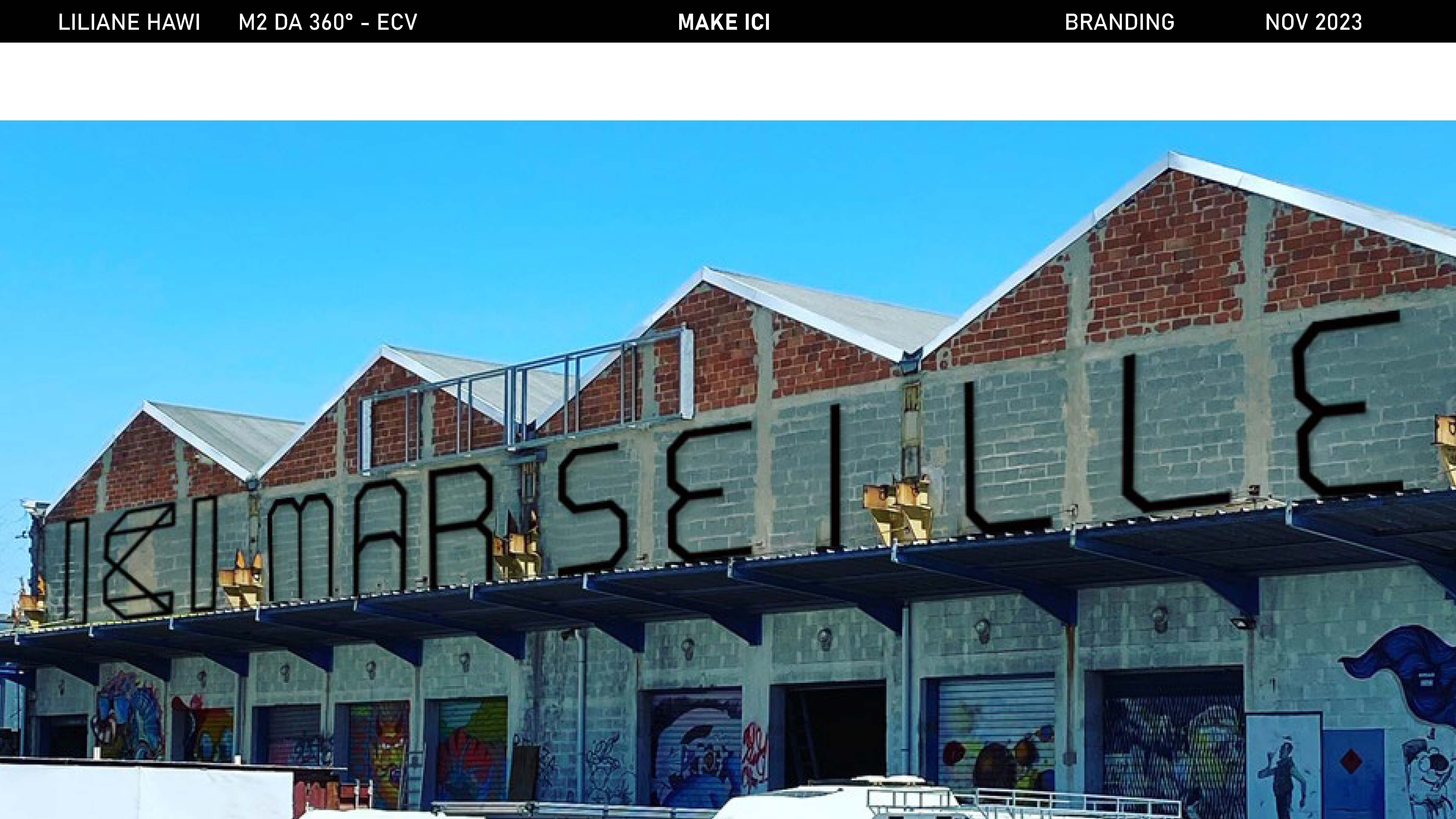
Structures: The shapes, lines and symmetries of objects, machines, tables and the physical structures of the workshops influence the design of the new typeface. Geometry, union: Straight lines and diagonals connect to reflect the interaction and connection between workshop elements, symbolizing the collaboration between craftsmen but also with their tools. Balance between rigor and fluidity: straight lines represent the precision and rigor of mechanical elements, while diagonals add a touch of fluidity and freedom, symbolizing movement and creativity in the crafting process. Functionality: Despite its complex visual appearance, the functional, legible font demonstrates the ability to combine artistic aesthetics with practical utility. It ensures practical use in a variety of contexts. Authenticity: The typeface can become a distinctive visual representation of the “Make Ici” collaborative workshop, capturing its artisanal and creative essence that animates the place.
